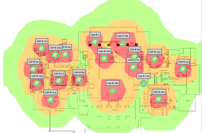
The Death of the Heat Map
The Death of the Heat Map
Fifteen years ago, when organizations were just beginning to experiment with 802.11 wireless networks, the WiFi heat map was considered a good, splotchy plan to show where wireless would be available, and how good it might be. Wifi can travel pretty far under the right conditions. Back then, we built networks for coverage, not necessarily capacity. So any signal was a good signal.

A few years later, we began building WiFi networks for capacity. The object was/is to provide good connections to a community of users across the whole campus. For a good experience, one needs to make an association with an access point that is nearby. Generally, the closer the AP, the better the signal and thus the higher the negotiated data rate. In short: nearby AP good; far-away AP bad.
Consider this, though: if every client is going to be near an AP, then every AP is probably going to be near other APs. That means that there will be overlapped WiFi. Here is an example of what we find in the air is a typical busy campus. This data, in fact, is associated with the heat map above:

The list shows that from the location where the measurement was taken, the client could hear 28 unique access points and 43 radios! Moreover, many of them were on same channels. There were, in fact, so many APs in this space that the amount of bandwidth available for users was being cannibalized by WiFi management frames. This was particularly true in the 2.4 GHz band, where slow beacons transmitted by every radio, every 100 ms could consume the lion’s share of the channel in a kind of death of a thousand cuts. So, in this case, pretty heat map; bad WiFi.
Dense WiFi networking depends on lots of APs running at low power, near their clients. The WiFi infrastructure can play many roles in encouraging clients to choose AP associations wisely. And the latest current WiFi standard, 802.11ax, provides extra features for managing overlapped APs. WiFi has advanced to reach blazing speeds and high densities in the last fifteen years, but the heat map doesn’t tell you much more than it did back then.
- Kevin Dowd